Letterfountain is a good and valuable resource for designers with interest into typography. Available in several languages, the website companion propose a good page about some basics for typeface designs… Who can recognise a Typofonderie typeface on the examples?
→ Read…
Quelques livres dédiés à l’apprentissage de la typographie et création de caractères, et les sites web qui proposent des sélections d’ouvrages sur la typographie.
Dernière mise à jour: 6 mai 2014
→ Read…
A message from the Occasional dispatches from the MATD and TDi Panopticon: We are looking for exceptional candidates for full-time postgraduate study in the Department of Typography at Reading.
→ Read…
Industry leaders conduct a rigorous 5-week intensive program in typeface design this summer at Cooper Union’s New York City campus.
Students of the summer intensive program take part in an integrated foundational course of lettering, history, and theory taught by veteran type designer Sumner Stone (former director of type at Adobe and founder of the Stone Type Foundry). Tools and principles of digital typeface design are taught step by step through an individual typeface design project with Sara Soskolne (senior designer, Hoefler & Frere-Jones). Students are also introduced to the art and science of bulletproof font production by Andy Clymer (senior typeface developer, Hoefler & Frere-Jones). The course is rounded out with guest visits and field trips to notable typographic institutions in New York City.
The application deadline is midnight on February 28th, 2011. The program is limited to 15 participants. Students will be informed of their acceptance status by March 15.
See the Application page for detailed application instructions.
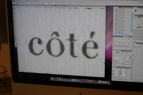
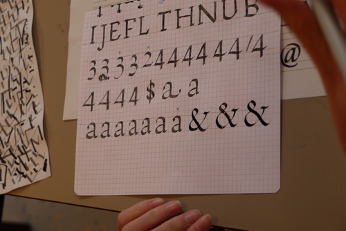
During last few days, 16 students have worked hard to design two typefaces. Here after images from the workshop that I have conducted.
☞ Lisez la suite...
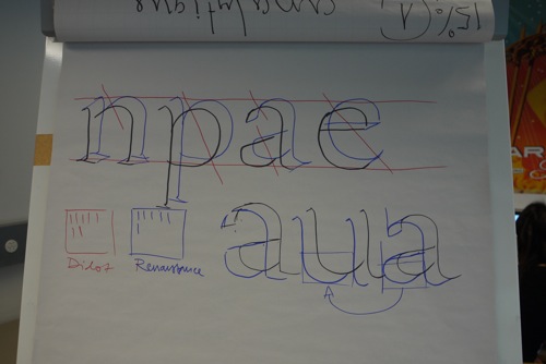
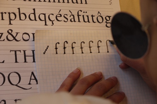
Une première matinée vouée à la pratique de la calligraphie et apprentissage de quelques bases de dessin de lettres. Dès l’après-midi, chaque groupe abordera une manière d’aborder le dessin de caractères différente: d’après l‘écriture à la plume plate, référence à la Renaissance — d’après un modèle historique du XIX e de style Didot, donc très construit à axe droit sans référence à l‘écriture.
→ Read…
Les quelques points importants pour bien démarrer le workshop de création de caractères HEAD 2010 que nous allons faire ensemble du lundi 3 au jeudi 7 mai 2010.
→ Read…
Liste du matériel nécessaire pour le workshop de l’HEAD 2010. De petites variations peuvent exister, mais il semble que ce que je demande est souvent le matériel de base du parfait graphiste.
→ Read…

Après 2 jours octobre 2009, suivi de 2 autres jours en janvier 2010, un petit groupe d‘étudiants (6 étudiants) a suivi un de mes ateliers de création de caractères typographiques. Retour et conclusions.
→ Read…