For the second time, following a very succesful trip in 2013, we will be back to New York between the 11 to 16 february 2014 with a group of 10 french students! As last year, the 2014 trip in New York will be the cherry on the cake.
→ Read…
Last semester, our students from the ECV Typographic design have to work on a revival of typeface: Re-création that’s the word we use in French. This project was just a part of a more wider Typographic design course, see the short presentations about their last semester here.
→ Read…
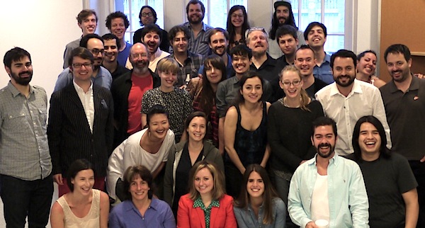
This master in typographic design started in early 2012, its the second class we have. Our topics cover typography in many area as possible: identity, editorial project, signage, events identity. The group of various instructors that I manage works well. In addition we teach them lettering, and typeface design. We invite also several professional to present they work and share experiences.
→ Read…
Pedro Amado posted two good quotes typeface design students.
→ Read…
100% d’accord avec cette approche expliquée par Thomas Huot Marchand. La création de caractères n’est pas une fin en soi, mais un outil indispensable de compréhension du graphisme et usages de la typographie au sens large…
→ Read…

The greatest part of this new Master is that a group of students will visit New York between the 20 and 25 February 2013. For them, I have built a strong program with the help of many friends in New York and elsewhere…
→ Read…

A week after, a lot of happened. On Monday 9th July 2012, they received the visit of Erik van Blokland for two days of type crits. It was big push for them as any other further external type crits. On our side, Stéphane Elbaz and myself, what was really appreciable is to see how what we try to explain for the last few days are just confirmed in a different tone from an external voice.
→ Read…

The personal project started on 25th June 2012. The groups spent long hours to built and confirm the style of their typefaces. First thing was to set the contrast and relation with basic serifs. Then, they worked on how the endings will relate or not to basic serifs. All key letters have been created on tracing paper to avoid to mix two very different steps: conceptualisation and production.
→ Read…

Last week, the group 2 have to design their first set of letters. Designed by hand (no rulers) on tracing paper, here after the results. As we will spend 4 more weeks, together, perhaps its time to present the students along their current project?
→ Read…