Apolline is my second typeface, started in 1989-91, finished in 1993 for the Morisawa awards in Regular and Italic. During this period and particularly for this project I made drawings modelled after my own calligraphy. They were done at a very small size on tracing paper (2 cm high for the capitals) to preserve the irregularity of human handwriting. Besides emphasising the horizontal parts of the letter forms, the serifs were designed asymmetrically to reinforce the rhythm of the writing. The final drawings were produced at a large size (10 cm high for the capitals) to allow for subtle optimisation of specific details. To achieve certain regularity, a template was designed.
☞ Read…

Top line: Sabon Next LT with alternate q and Sabon Next LT; Bottom line: Sabon Italic compared to Sabon Next LT Italic all kerned.
For some people, the finish of Sabon Next perhaps looks similar to Adobe Garamond, but if you set texts, the result is quite different, because the structure is not the same. Adobe Garamond looks to be wide and round when Sabon Next looks narrow and strict.
☞ Read…
Je crois que tout caractère typographique ne peut évoquer clairement quelque chose que lorsqu’il est associé à un contexte graphique: Une gamme de couleurs, une mise en page, une marque, un nom, une période historique (?), un sujet…
☞ Read…

Interesting image who show various sanserif in use in Paris in 1908.
☞ Read…

Extrait de Futura, une gloire typographique
On n’en connaît aucune autre semblable. Elle est sans doute la toute première (1927). Elle se distingue par des m & n absolument rectilignes; par un r qui est une barre suivie d’un point…
☞ Read…

When you can choose between two types of OpenType fonts, should you use PostScript format (CFF) with the extension .otf, or TrueType format (TTF) with the extension .ttf?
Perhaps TTF is better if good hinting is included in the font BUT as 99% of fonts are designed in Béziers curves…
☞ Read…

Assiettes très typographiques, qui nous proposent un abécédaire coloré et ludique: “Portez ce vieux whisky au juge blond qui fume”. Available in UK too.
☞ Read…
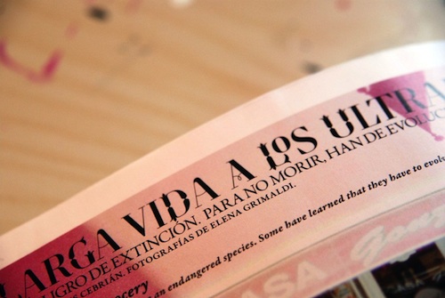
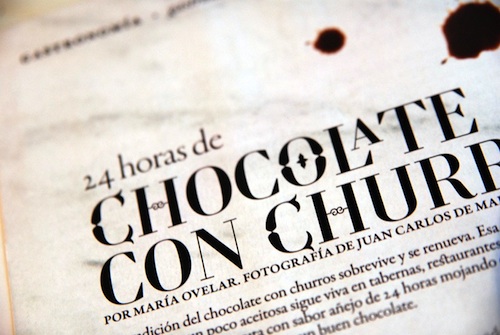
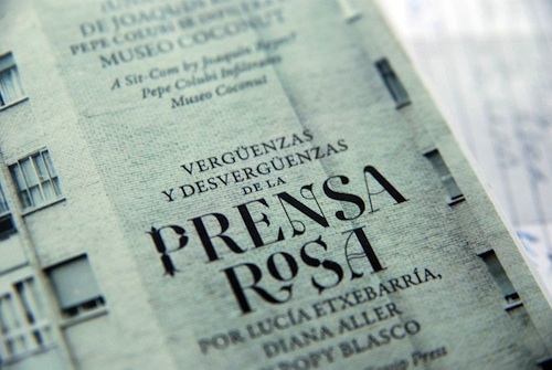
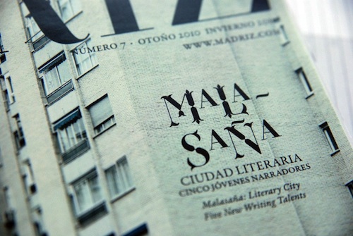
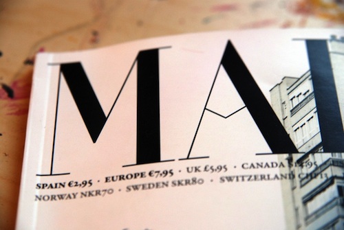
A recent issue of Madriz magazine featuring the final version of the multi awarded typeface Retiro.
☞ Lisez la suite...
 Dans le cadre de la nouvelle formule en préparation, j’ai été chargé par le magazine Notre Temps de revoir leur têtière. Quelques réflexions à propos de ce travail maintenant terminé.
☞ Read…
Nice use of typography on this film about Paris. Be sure to watch others cities.
☞ Read…